Walking into a temperature gradient
Whether you realize it or not, you have experienced a temperature gradient.
Picture this: The temperature outside is 95°F and you're blasting the AC inside your home. When you open the front door and walk inside, you get hit with the cool AC. This is an example of a mini temperature gradient. The door is a boundary between the cool air inside and the hot air outside. Think of it as a front.
A temperature gradient is a change in temperature over the change in distance. You can calculate the temperature gradient across a town, a state, or even a country. Just subtract the two temperatures and divide by the distance.
Temperatures on weather maps are plotted based on colors, where darker colors correlate to hot temperatures and lighter colors are colder temperatures. Isotherms are lines plotted on weather maps that connect equal temperature points.
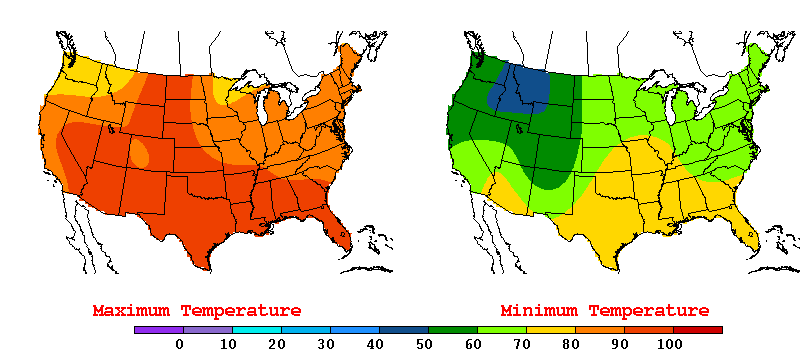
When isotherms are very close together, they are said to be "packed." This means there is a strong temperature gradient, or a rapid change in temperature, over a small distance. If the isotherms are “loose” and spaced very far apart, then this tells you that the temperature is very consistent over a large distance. You will often see packed isotherms along a front, such as a cold front. Whereas, ahead of the front the isotherms will be loose.
Curveball! Most weather maps you see on TV don't plot isotherms but instead plot pressure contours. Temperature and pressure are very closely related. As pressure increases, temperature also increases. As pressure decreases, temperature also decreases.
On weather maps, the lines connecting points of equal pressure are called isobars. Just like how temperature changes over a distance, so can the pressure. Similar to isotherms, packed pressure contours refer to a strong pressure gradient, whereas spaced isobars refer to a weak pressure gradient.
Because of their direct relationship, if you have a strong pressure gradient, expect a strong temperature gradient. Look at the example below. Over central Canada, there are tightly packed isobars around the center of low pressure. Next, look over the Southern Plains. Notice how the spaced pressure contours indicate a weak pressure gradient. You can gather that the pressure across the Southern Plains and even east towards Florida is similar. Likewise, there will be minimal variation in temperatures.
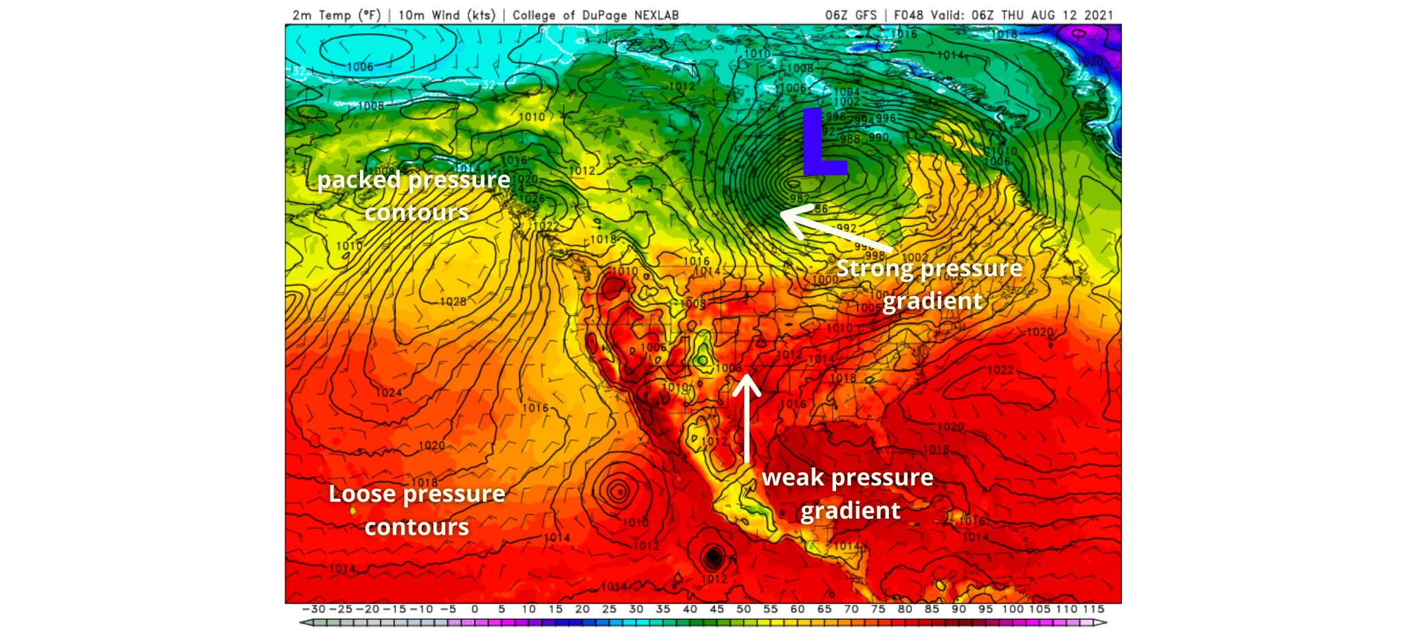
Temperature and pressure gradients give clues as to the location of fronts on weather maps. Fronts are often the forcing mechanism for showers and storms and are responsible for moving air masses.
The cold front
Raise your hand if you're praying for a cold front this week!
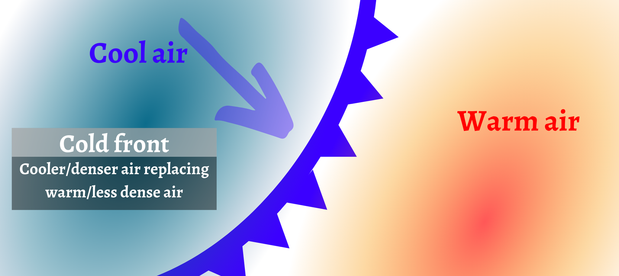
A cold front is a transition zone from generally warmer air to cooler air. When a strong cold front passes, temperatures can drop dramatically. Cold fronts typically move from the northwest to the southeast. To find a cold front on a weather map, look at the temperatures and the isobars. If you see tightening isotherm contours or troughing in the isobars, that's the likely location of the cold front. If you notice colder air is replacing warmer air, this is another indicator a cold front is advancing. A blue line with triangles on a weather map depicts the boundary of a cold front on weather maps. The triangles will always point towards the warmer air.
What about the warm front
A warm front is something we don't want in the summer. The front brings hotter temperatures and higher humidity into a region.
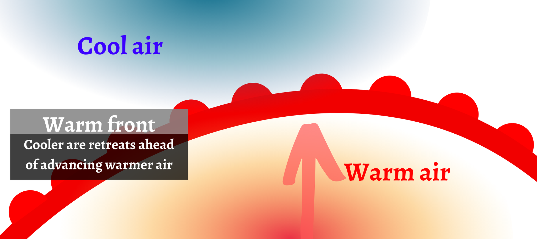
A warm front is a transition zone from relatively cooler air to warm air and is depicted on weather maps by a red line with half-red circles pointing towards the cooler air. Typically warm fronts move from the south to the north and are on the east side of low pressure. If you look at the image above of the low pressure over Canada, you'll see a sharp temperature gradient east of the low pressure. Temperatures change from the 40s to the 50s across this area and the most likely location of the warm front.
Fronts and pressure
Fronts are associated with areas of high and low pressure. Because warm air is less dense than cold air, it rises and creates lower pressure at the surface. A red L will plot the location of surface low pressure on maps. If you see low pressure moving in, especially in correlation to cold and warm fronts, you can expect rainy weather with relatively cooler air behind the front.
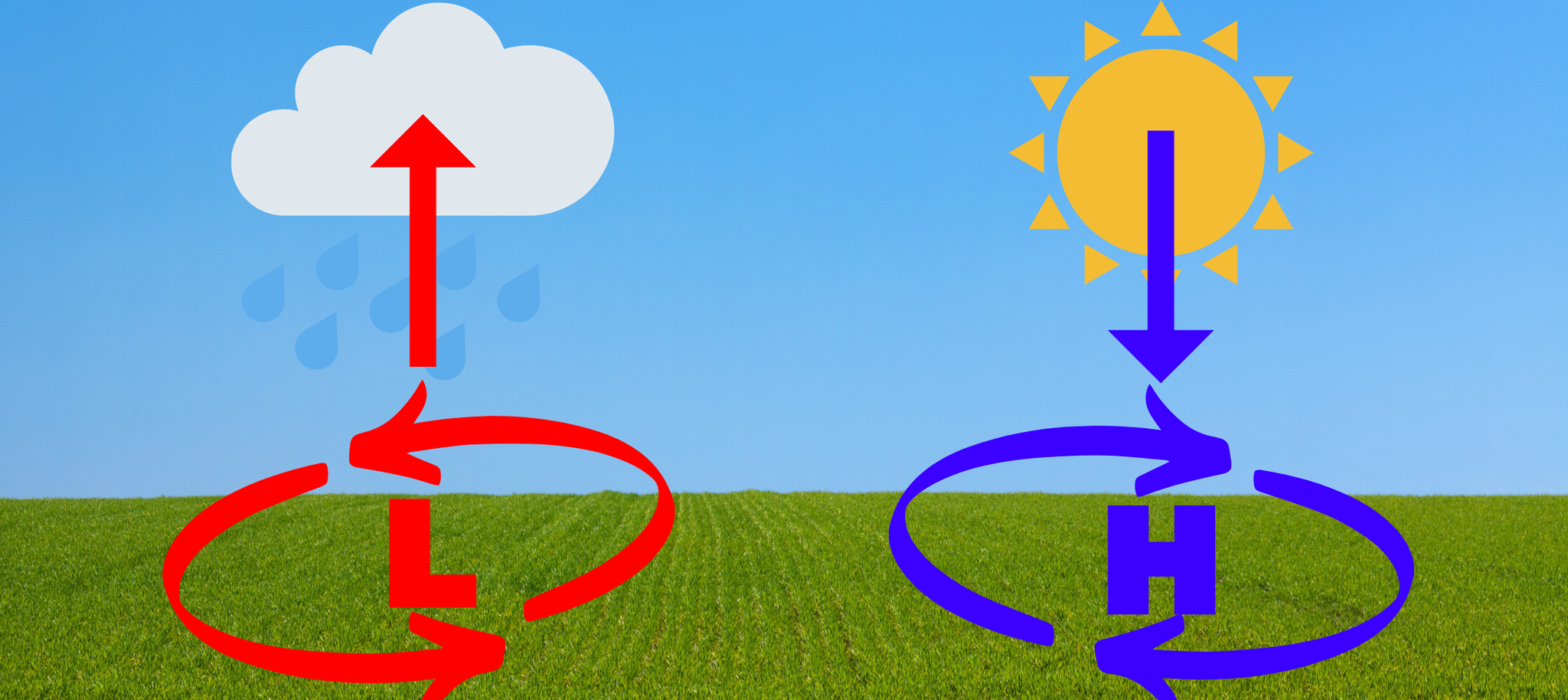
Since cooler air is denser than warmer air, cold air will sink and raise the air pressure at the surface. A blue H will mark the location of high-pressure systems on weather maps. Conditions under high pressure are generally warmer and drier.
You can track the fronts yourself. The Weather Prediction Center is a fantastic source for weather maps and has automated plots showing the fronts and pressure.

1 Comment Add a Comment?
Mark
Posted on Aug. 16, 2021, 4:13 p.m.
Leah, good info, as usual!